Forms are the keystone of user interfaces
Learn how to build usable and contemporary forms. So that your users don't suffer. For devs and everyone who is interested in UI/UX.

Are you a developer? Solopreneur? Don't have a design background? Cannot afford a designer?
I have something for you. A book about how to make your forms better.
Remember - forms are the most crucial thing in applications. And they should be good.
I'm Victor, and I've been working as a frontend and backend developer for more than 10 years.
Have you ever worked in a team that did not have a designer, and you needed to figure out how forms should look on your own?
When your boss just asked you to "make it work", without caring how it looks, without caring about user experience?
But you cared? Then, we are in the same boat.
For some unknown reason, my teams almost never had a dedicated designer. Sometimes the designer and developer were the same people. Nobody really cared about design.
I don't like this approach. I think that if you do your job, you should do it well. That's why I'm always researching best practices related to user interfaces.
This book is a compilation of what I know about forms.
An example of refactoring a form
I took a quite outdated form that violated a lot of common UI/UX principles.
I redesigned it and gave some step-by-step explanations of my decisions based on the theories I describe in the book.
As an example, I have provided a form example below that is a sample of how a form can be redesigned. Here you can see an illustration of why small details matter.
Hover on the icons below to reveal explanations.

Notice that the country goes first. Depending on the country selected, we will choose whether to use state and zip, or postal code (naming conventions).
It's a typical trick to make it easy for users to understand what kind of information we expect from them: postal codes cannot be very long.
It might be left as "Cancel" as well, it's just an example of different possible variations.
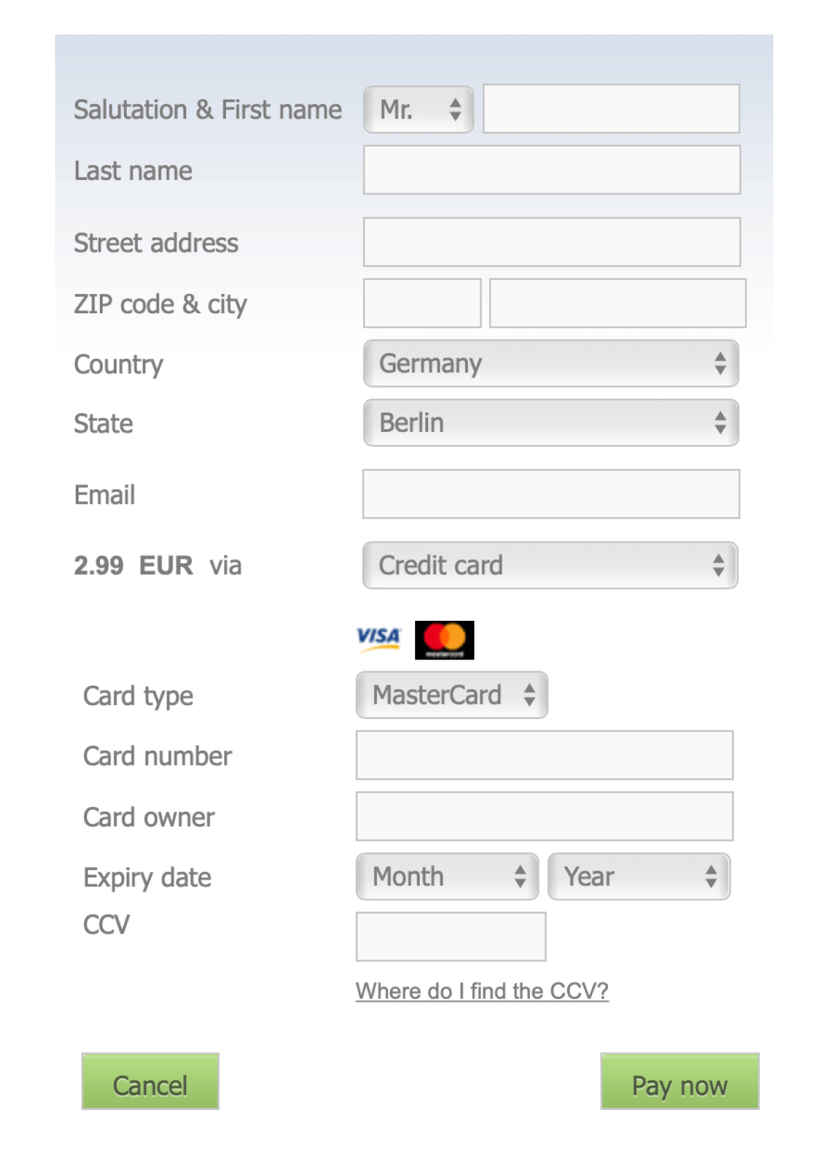
There are a few chunks of information that we ask for from the user: personal info, address details and card details.
They should be visually separated by using space & headings, according to the Law of Proximity.
Why? You will find out in the package with extra tips! :)
It should be one field with a mask, like MM/YY.
- The most important ruleThere is a huge common mistake when it comes to form design. We will cover something that will improve your forms drastically and immediately.
- LayoutsThere is a huge variety of form layouts; each one having their own advantages and disadvantages
- General conceptsIn this chapter, most of the concepts covered here can and probably should be applied to your forms. Some of them are well-known, while some are more complicated and noteworthy.
- ValidationThis is I would say the most crucial thing that I attempt to describe in detail. Starting with when to validate and ending with what a good error message is.
- Help usersThere are a number of ways you can help your users so that they don't even make any mistakes at all.
- Scrutinizing inputsEvery input has its own peculiarities. Some of the most complex ones are covered in this book.


- Adrian TwarogCreator of enhanceui.com
This book provides a wealth of knowledge on the core aspects that make great UI's work, and the UX that goes on behind the scenes often goes unnoticed.
Grasping these techniques will improve your design skills now and long into the future!
- Arvid KahlAuthor of Zero to Sold & The Embedded Entrepreneur
Victor's insight into interfacing with human beings will be "formative" for your product.
All jokes aside, Re:Form is for a UX designer what a chef's knife is to a chef: a no-nonsense tool to get the job done efficiently.
A reference book for everyone who touches forms in their work.
- Simon Høiberg
By reading this book you'll gain enough knowledge to avoid typical mistakes when working with complex forms.
By reading the case study you'll see it in practice.
By reading extra tips you'll even more enhance your knowledge.

I'm a developer that is passionate about UI/UX.
However, my content (tweets) and testimonials say it better. I imported some of my tweets and comments from product hunt launches below.
All are real, clickable posts, with no fake images.
It is especially useful for developers, UI/UX designers and product owners who want to level up their skill of making good interfaces.
So basically it's a practical part, while the core book is a more theoretical one.
Just drop me a message and I'll do that. Please, no later than 30 days.